Interaction
My design approach is to make the interaction engaging, fun and intuitive. How people use their devices, specifically, how they interact with their devices has altered my approach to some classic design principles. We're all familiar with the Gutenberg Diagram but what I realized is that designers continue to place navigation elements at the top of the screen. This wasn't an issue with desktop nor mobile devices used in landscape but the vast majority of users hold their devices in portrait view and overwhelming use one hand. This led me to a recent project where my redesign efforts put to use a bottom navigation. It felt right and now you see many of the larger companies like Twitter and Facebook using this approach.
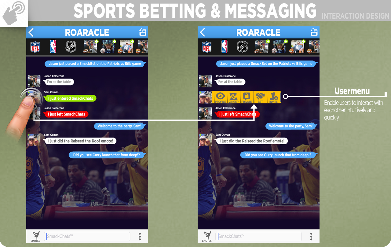
Messaging User Menu

To greatly improve interactions between users I designed a user menu for the messaging system in a sports app. Simply tapping on the user icon evokes the menu to enable greater engagment with the other users.
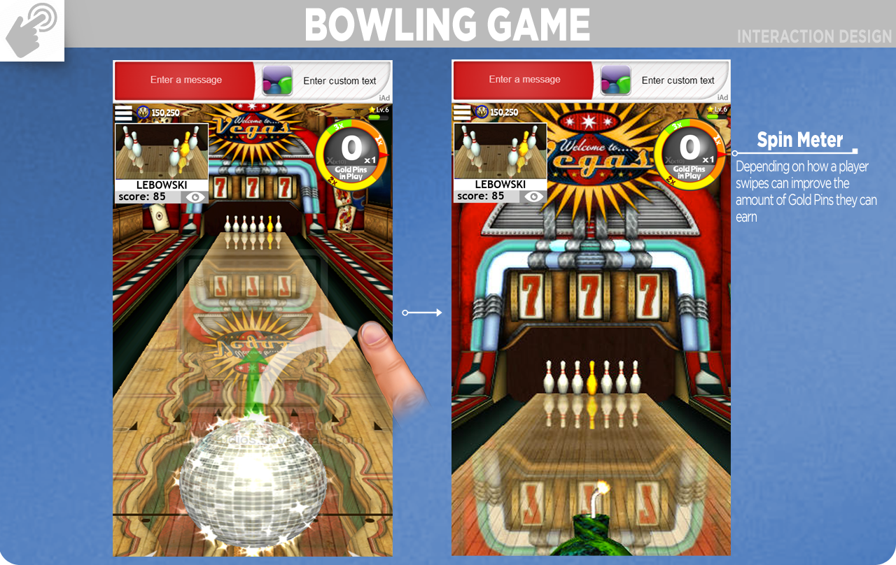
Bowling Swipe Mechanic

I worked extremly hard to create the realistic feel of adding spin to your throw by using a swipe motion on mobile devices. This included getting inside unity and creating friction pads to simulated the oil consistency on actual lanes.
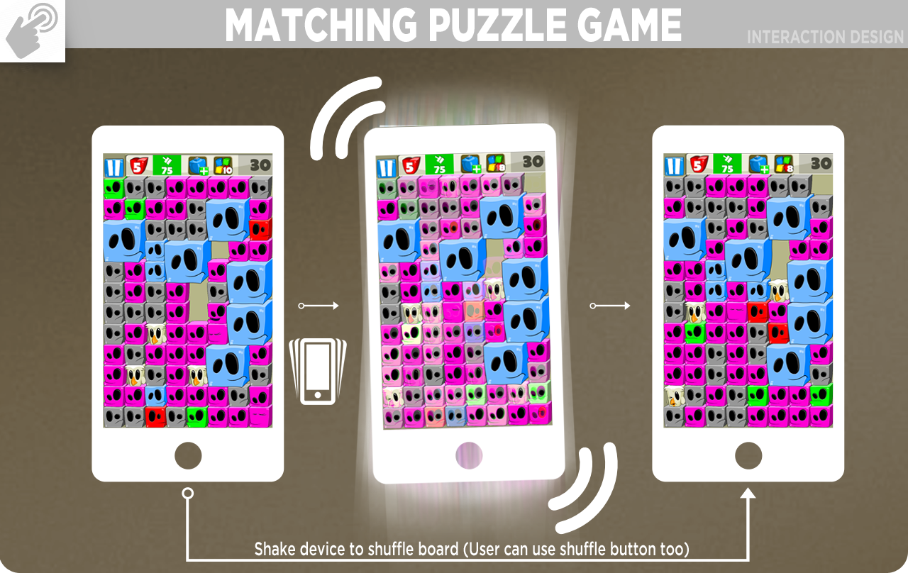
Match Game Shuffle

I mapped the key power moves, rotation and shuffling, to the fun features of mobile devices. Using the accelerometer and gyroscope, I designed the rotate to change with the tilt of the device and shuffling the board to the shaking of the device. Each had to be tuned to feel intuitive and not overly sensitive.