The New Frontier
Mobile presents similar challenges that the 28.8 modem and other technological hurdles I successfully leaped over in the mid 1990s. Technology is one challenge but how people interact with mobile devices and where is quite different than the old desktop and mice of yesteryear. I've revisited designs I failed to make the transition from desktop to mobile early on and have been hired to fix designs that didn't rethink the platform and user behavior.
Technology
Some challenges designers and developers have overcome on mobile is RAM. Just like in the early days of desktop games being intelligent about your  designs so that art requirements are efficient and optimized is crucial. As a designer and art director these challenges are always on my mind. How to pack a sprite sheet, when to use 9square cutouts for UI elements and what to include in the app or stream using bundle assets all come into play when designing for mobile.
Connectivity
With the instability of cellular connections ensuring the your UX designs provide a clean feedback look and clear process in which a users action  makes sense to them can be the difference in retaining a customer or losing them. Mobile users aren't patient and want feedback immediately. In the products I've worked on where connectivity was a large part of the experience I was able to design feedback looks the provided clear alerts, concise call to actions and alternatives engineering could implement to address poor connection issues through caching and indexing data.
Interaction
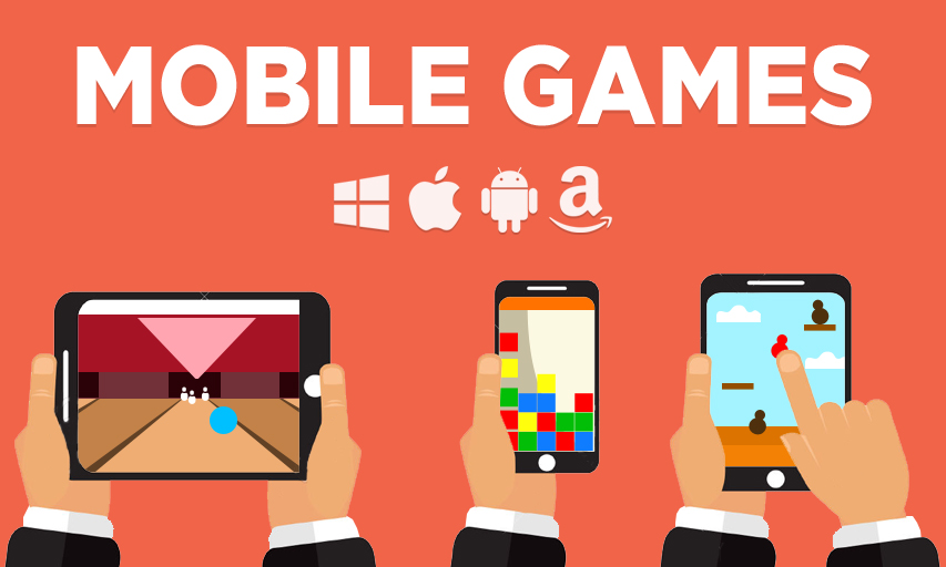
Touch screen, gps and the accelorameter introduce some powerful features that can make a users experience more engaging and unique. Our first game ported to mobile I designed some of the bonus moves to take advantage of some of these unique features. Users could rotate the device to strategically rotate the game board or shake the device to shuffle and create better matches. With GPS, people could challenge people nearby to a friend or competitive game of bowling. Touch enables click games to be faster of matching games, drag and swipe much engaging for spelling words or making combos and swiping in different angles to dictate the spin on a bowling ball or match a motion to knock out your presidential candidate.
Navigation
How people use their devices, specifically, how they interact with their devices has altered my approach to some classic design principles. We're all familiar with the Gutenberg Diagram but what I realized is that designers continue to place navigation elements at the top of the screen. This wasn't an issue with desktop nor mobile devices used in landscape but the vast majority of users hold their devices in portrait view and overwhelming use one hand. This led me to a recent project where my redesign efforts put to use a bottom navigation. It felt right and now you see many of the larger companies like Twitter and Facebook using this approach.