Page Flows
I use page flows as a bird's eye view of everything to give a general direction of where a user can go. They are typically a high level view that allow me and stakeholders to feel the size and complexity of the project.
Mobile Game

Here is an example from the updated app version of QBeez where the objective was to simplify the path to game play and to make the experience more organic. I started with sketches on paper, then digital mocks that you see below that were used with inVision to create a prototype.
User Flows

I turn to user flows when wanting to articulate and work out a more micro view, looking at directions from point A to point B. You're able to see which path to take, where to turn and the distance it takes to get there. These details aid me in getting to my destination efficiently. The low level view enables a me to feel how much time and effort it takes to complete an action or task.
Storyboards

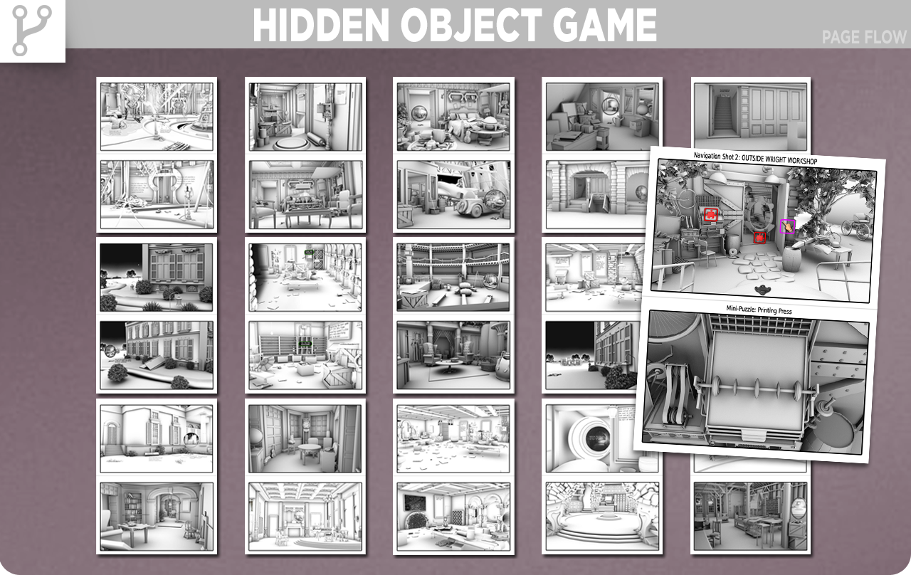
I first developed storyboards for the side scrolling hit game Tamale Loco. These storyboards were specifically for the animated story that played between levels. Years later I used storyboards as a flow diagram for our hit series Flux Family Secrets. I developed the 3D scenes and positioned the camera to render the angles that best fit the mood chart of the story. I printed these key scenes, well over 50, to layout the flow the user would take. This process, like the page flow, identified disconnects in the user experience and due to time constraints made it easier to identify what could be cut from the game without losing time or money. With the storyboard flow I was able to then focus on the user flows in the form of quest chains and continue to see the macro view and the micro view to identify bottlenecks or kinks in the progression.