User Interface
My approach to interface design is to keep it clear and concise. No need for the user to spend any time trying to figure out what to do or what is going on. Depending on the design objectives the styles will change but the foundation of what good user interface design is does not.
Sports App
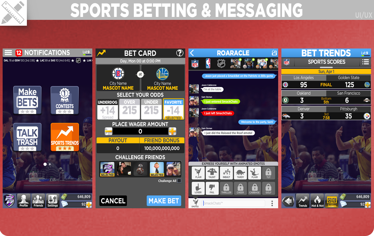
The original design had missed the mark for the audience and the platform. I was tasked with doing an incremental design overhaul as well as designing new features leading up to the roll out. After setting up several user tests with key audience targets I confirmed that the majority of our audience holds their mobile device with one hand making a top navigation cumbersome to use. Using this as my guide I redesigned the UI and UX from a monocromatic landscape view that targets tech folks to a energetic interface in portrait view with larger buttons and more concise navigation.
Matching Game
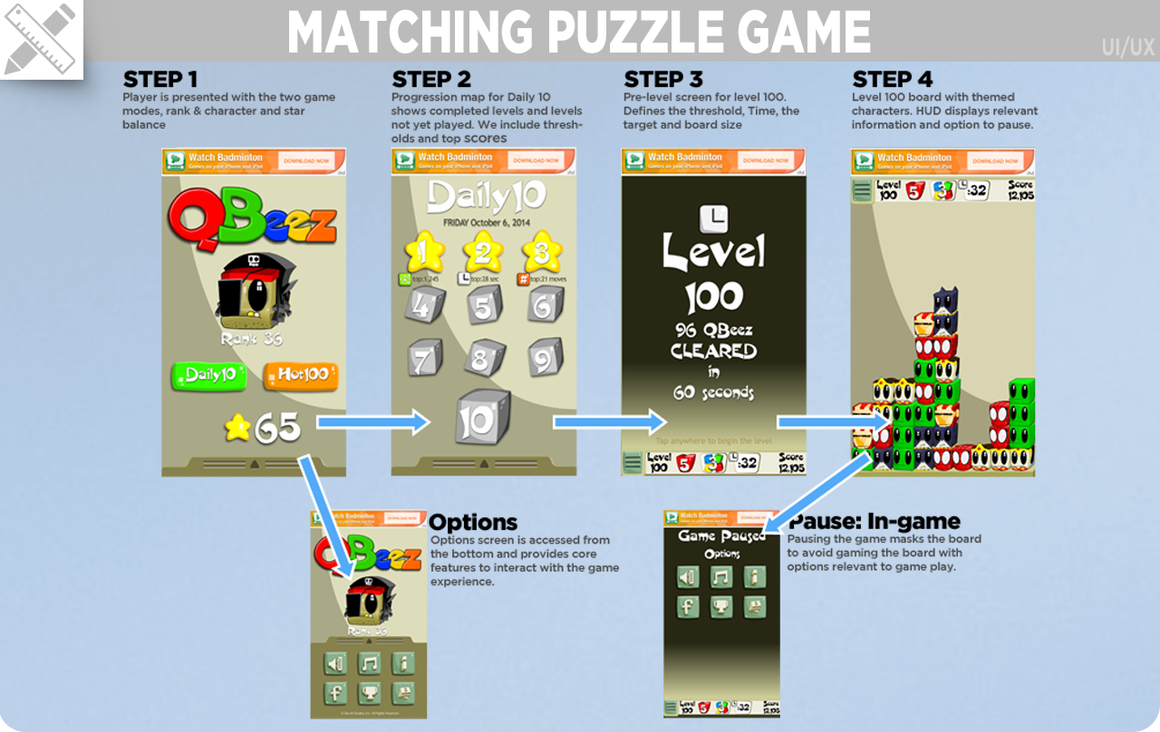
Tasked with designing the 2.0 release of the popular game QBeez I set out improve several KPI's. The first was streamlining the UX to be intuitive and immersive that improves engagment. The second was working through a compulsion loop that improved retention and monetization. By tying a currency that rewards players for how they complete a level that can be used to redeem more fun and cool characters that change the gameplay is a winning formula and compulsion loop. This invloved sketches, wireframes, economy spreadsheets, developing a formulas for level thresholds and prototyping.
Medical App
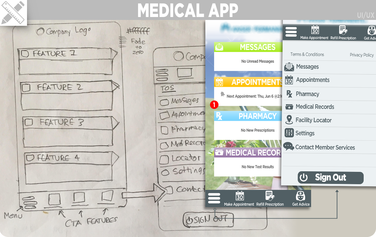
Presented a design that improved navigation and interaction for a medical app. Sketched out a layout and design that was inviting, professional and intuitive.
Game Elements
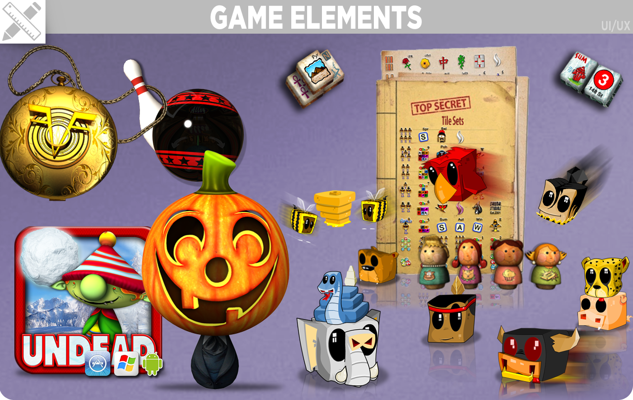
I've created art for UI, game elements, icons, logos and marketing materials. My strengths are creative/art direction where I can sketch out what is the best style to move forward in and let the really gifted artists work their magic. I have, however, got my hands dirty and have created great visual designs. My most defining skill set is characters. Just about every game I've worked on I've lead the creation and design of the characters. This developed a strong and recognizable style that grew a large and loyal following for Skunk Studios.
Characters
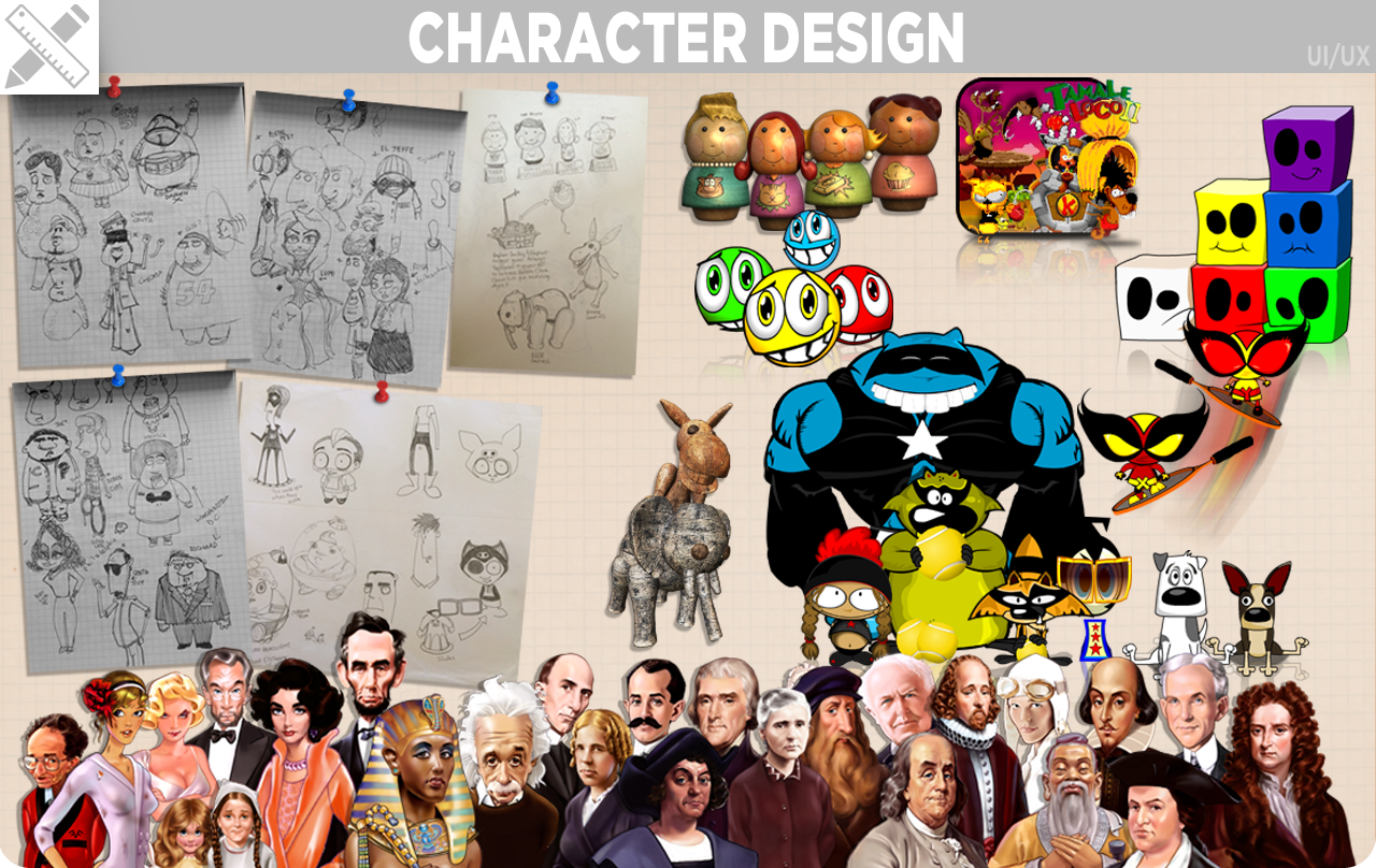
Getting a player to emotionally invest in your product is a factor I targeted through the types of characters I designed for my games. Whether an affable mouse that uses his sombrero as a parachute as he jumps from platform to platform or a square character that cries when you leave it behind as you try to clear the board, the characters I've created have had a lasting impact. Tamale Loco was nominated for Best Character at GDC and it was the only 2D character nominated as well as the only nomination from the casual games space. I put character into word tiles, bowling balls, level nodes. Anywhere you can get an emotional response and engage the player, I focus attention and try to bring life to it.
Style Guides
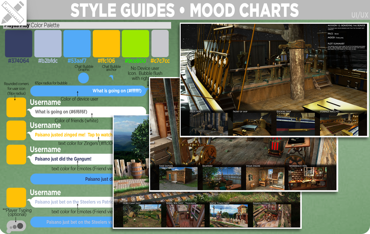
Style guides are a good way to define the standards for design of your product. It enables me to remain consistent on larger projects and avoid not having a cohesive experience for the users.